![]()
Have you ever looked at your brand’s logo on social media and felt something was just… off? In the digital age, where first impressions are often made online, a misfit logo can be more than a minor nuisance—it can be a missed opportunity. Let’s dive into why social media logo adaptation, and stepping outside of your branding guidelines is not just a good idea… let’s be bold and say it is essential.
Social media platforms, each with a unique style and audience, also have their own image rules. That sharp, square logo of yours? It may have been initially designed and presented on a business card layout or looks striking as signage above your storefront. But how does it look when crammed into a circular Instagram profile frame or stretched into a horizontal Twitter banner? It might just look less striking and memorable. The solution can be more complex than just resizing. Sometimes, it requires a thoughtful tweak or a redesign with specific consideration to fit beautifully into that new circular digital profile space.
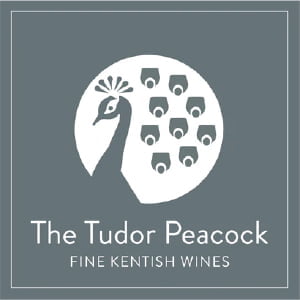
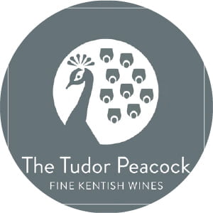
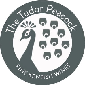
Take the case of The Tudor Peacock, a business with a beautifully designed, square logo. While perfect for their website and print materials, on Instagram, it looked awkward, like a square peg forced into a round hole. Recognising this, I reached out and suggested a subtle redesign. The result? A logo that maintains its original charm but fits seamlessly into the circular space of Instagram’s and other social media profiles’ circular containment frames, enhancing their online presence instantly.
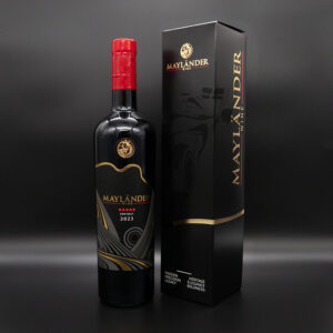
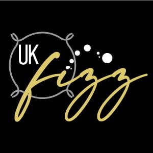
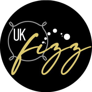
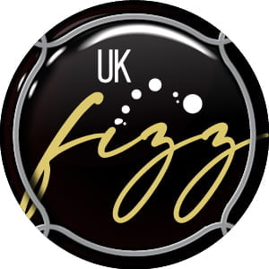
Let us take a look at our own logo for UK Fizz. The logo is rectangular in dimensions and looks excellent in this website’s top left-hand corner. Displayed below, it still looks fine in that circular social media profile framing. But why not have a little fun by keeping the logo’s overall true nature and brand consistency and developing a profile image that looks more like a Sparkling Wine wire cage & muselet cap.
Many brands feature a combination of a logo and a word mark to define their overall aesthetic. However, when it comes to social media profiles, this could be an opportune moment to separate the two. Consider using just your logo without the accompanying text. On most social media platforms, your business name is already displayed right below your profile picture, making it clear that visitors are on the correct page. This presents a unique chance to highlight your logo in isolation, potentially making it more memorable than the full combination of your logo and word mark.
Each social media platform has its image dimension requirements. Know these before you start.
| Platform | Circular Profile Photo | Landscape | Portrait | Square | Stories | Cover Photo |
|---|---|---|---|---|---|---|
| 170 x 170 pixels | 1200 x 628 pixels | 628 x 1200 pixels | 1200 x 1200 pixels | 1080 x 1920 pixels | 851 x 315 pixels | |
| 320 x 320 pixels | 1080 x 566 pixels | 1080 x 1350 pixels | 1080 x 1080 pixels | 1080 x 1920 pixels | N/A | |
| 400 x 400 pixels | 1600 x 900 pixels | 1080 x 1350 pixels | 1080 x 1080 pixels | N/A | 1500 x 500 pixels | |
| 400 x 400 pixels | 1200 x 627 pixels | 627 x 1200 pixels | 1080 x 1080 pixels | N/A | 1584 x 396 pixels | |
| TikTok | 200 x 200 pixels | 1920 x 1080 pixels | 1080 x 1920 pixels | 1080 x 1080 pixels | 1080 x 1920 pixels | N/A |
Your logo should be recognised across all platforms.
A complex logo might lose its essence when resized. Simplify if necessary.
What looks good on a desktop might not on a mobile. Check everywhere.
A logo that fits well in its digital space isn’t just about aesthetics. It’s about making your brand approachable and memorable. Your branding can’t afford to be too square—literally. It’s about being adaptable, making sure that your first impression counts wherever your logo appears. When a potential customer scrolls through their feed, your correctly formatted logo can make the difference between stopping to engage or continuing to scroll.
If you took the time to read this article, we implore you to take a moment to review your social media profiles. Do your logos fit, or are they awkwardly trying to squeeze into a space they weren’t designed for?
If this post has got you thinking about your own branding, share your thoughts or reach out for a free consultation.